Pt. 1: Introduction
Woods by Design is a woodworking company that specializes in high-quality, custom wood pieces ranging from furniture to home décor. The founder approached me with the goal of creating a strong brand identity that could be used across both print and digital media.
This project focused on three main deliverables: the company logo, a business card design, and magazine advertisements to help them establish a professional and consistent visual presence.
Pt. 2: Logo & Business Card Initial Design
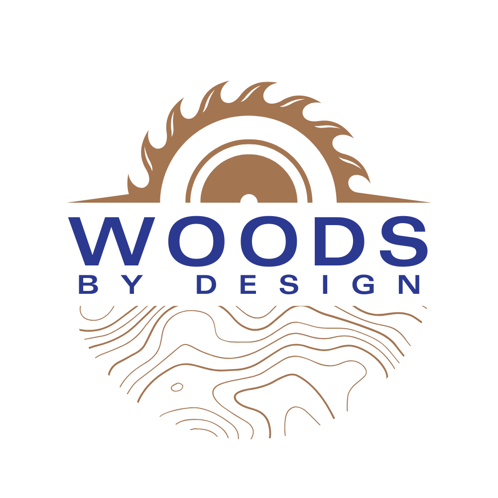
The first step was crafting a logo that felt timeless, grounded, and aligned with the nature of the brand. Since the company works with natural materials, I wanted the logo to feel earthy and handcrafted while still clean and modern.
After exploring different concepts, I landed on a minimalist logotype paired with an abstract wood grain-inspired emblem. The final logo balanced simplicity and personality—perfect for a brand that prides itself on custom craftsmanship.
My client specifically requested coloured samples. He also sent me ideas so that gave me enough to create a variety of samples. By giving something to go off of, my client found it easier to see what he liked or didn’t like this way. I did a number of iterations, each getting closer and closer to the final thing my client liked. I found that this approach worked best for clients that don’t know what they want or like.
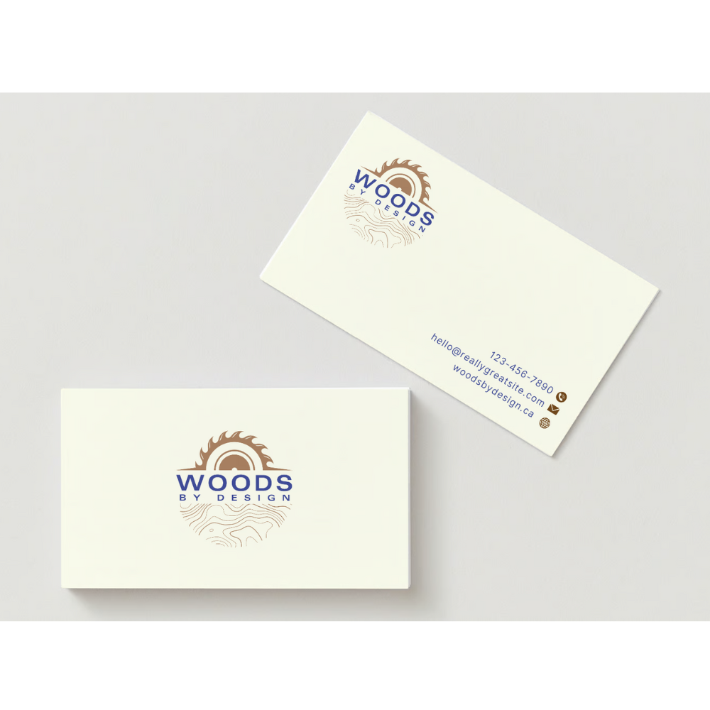
Pt. 3: Logo & Business Card Final Designs
After many iterations and ideas, we finally got to the final logo and business cards:
Pt. 4: Magazine Advertisements
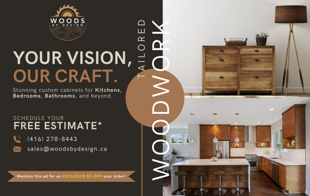
The final part of the project was designing a series of magazine advertisements. These ads needed to grab attention while staying true to the brand’s quiet elegance and handcrafted vibe.
I worked on layout, copy placement, and visual hierarchy to ensure the ads would work well in print and appeal to a design-conscious audience. Each ad featured high-quality photography, concise messaging, and the clean branding we had established earlier. My client requested to see all the advertisements in black and white so I included that variation with the coloured one.
My client decided that he liked the following advertisement the best:
Pt. 5: Reflection
This was a smaller-scale project, but still incredibly rewarding. I enjoyed the challenge of creating a visual identity that felt grounded in nature, while keeping everything clean and professional.
Woods by Design is a brand that lets the product speak for itself, so my job was to enhance and support that without overpowering it. The client was happy with the results and continues to use the designs across their marketing materials.