Pt. 1: Introduction
For this project, I had the opportunity to design an app aimed at enabling students from Humber College’s Industrial Design program to showcase and sell their unique furniture designs. The goal was to create a functional, user-friendly platform that not only displayed the designs but also served as a marketplace where potential buyers could easily browse and make purchases.
This project presented a great challenge as I was responsible for not only creating a smooth user experience but also integrating the seller’s side of the platform, ensuring that both designers and buyers had seamless interactions.
I chose to call my app: Olive.
Technology used:
- Figma — was used for all wireframing and prototyping
- Figjam — was used for brainstorming
- Adobe Creative Suite — was used to create custom graphics and logo
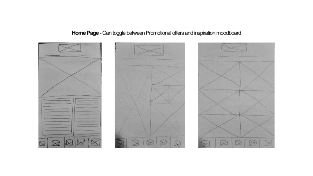
Home Page
The home page has 2 tabs, the collections tab and the inspiration tab.
In the collection tab, users will be able to explore exclusive collections, sorted by style.
The inspirations tab offers a range of aesthetic photography of not just furniture but decorated and furnished rooms. This is a potential collaboration between the ndustrial design students and photoragphy students. Buyers can explore this tab, find styles they like and sake their inspiration to come back to later.
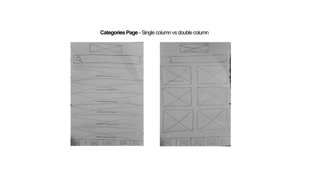
Explore App
The buyers can also explore the app and search for different furniture items. They can browse categories by room or furniture item. There is a special section of top designers included here as well.
This is for both the buyers and the sellers. For the Humber students, this acts as motivation for them to try and make it to the top designers of the month and for the buyers, it gives them a highlight of the best designers of that month for them to discover.
Single Product Page
The single product page showcases information about each product. It shows all the main information of the product, allows you to share or favourite that specific product, view the product with Augmented Reality (AR), read reviews about the product, discover the designer of the product and add the product to your cart.
Buyers can also explore similar products or products selected especially for the buyer according to their browsing history.
Favourites Page
The favourites page allows buyers to save any products or inspiration photos that they liked. They can manage all their saved content as well.
Cart Page
The cart page allows users to make alterations to their cart before moving onto submitting the order. It also suggests other items the buyer might be interested in, provides the option to apply discount codes and gives the users a summary of their orders.
Once checking out, buyers can provide all necessary information, make their payment and upon ordering, they’ll recieve their order confirmation.
Buyer Login
The buyer login page allows buyers to login to their account. This will give them access to the ability to save their payment, manually add their preferred style (to help the app recommend better products) and manage their account and orders.
Seller Login
The seller login directs Humber students to a separate login section. The colour of the app changes beyond this point to give the seller functions a distinct identity.
\The users can login or if they’re signing up they will have to provide proof that they’re Humber students. This exclusivity ensures that Humber students get priority and this app is a way to showcase their designs without external competition.
Seller Account
The seller account allows students to alter their bios, create new collections and add new products.
Seller Products
The sellers can also add new products or edit existing products. They have the option to add images, product specifications, details, styles and set their own custom price.
Seller Page View
The sellers can also directly view what their profiles look like to the buyers by sellecting “view as buyer” to make sure their profile is aesthetically up to their standards.
Pt. 2: Research & User Analysis
To ensure the app met the needs of both students (sellers) and buyers, I started with an in-depth research phase. This included extensive market research to understand the competitive landscape and user needs, especially for university-level furniture design students.
I also conducted competitive analysis and specifically looked at the digitial UX habits of both my buyers and sellers to ensure that my platform was designed to be as intiutive and suited to the target users as possible.
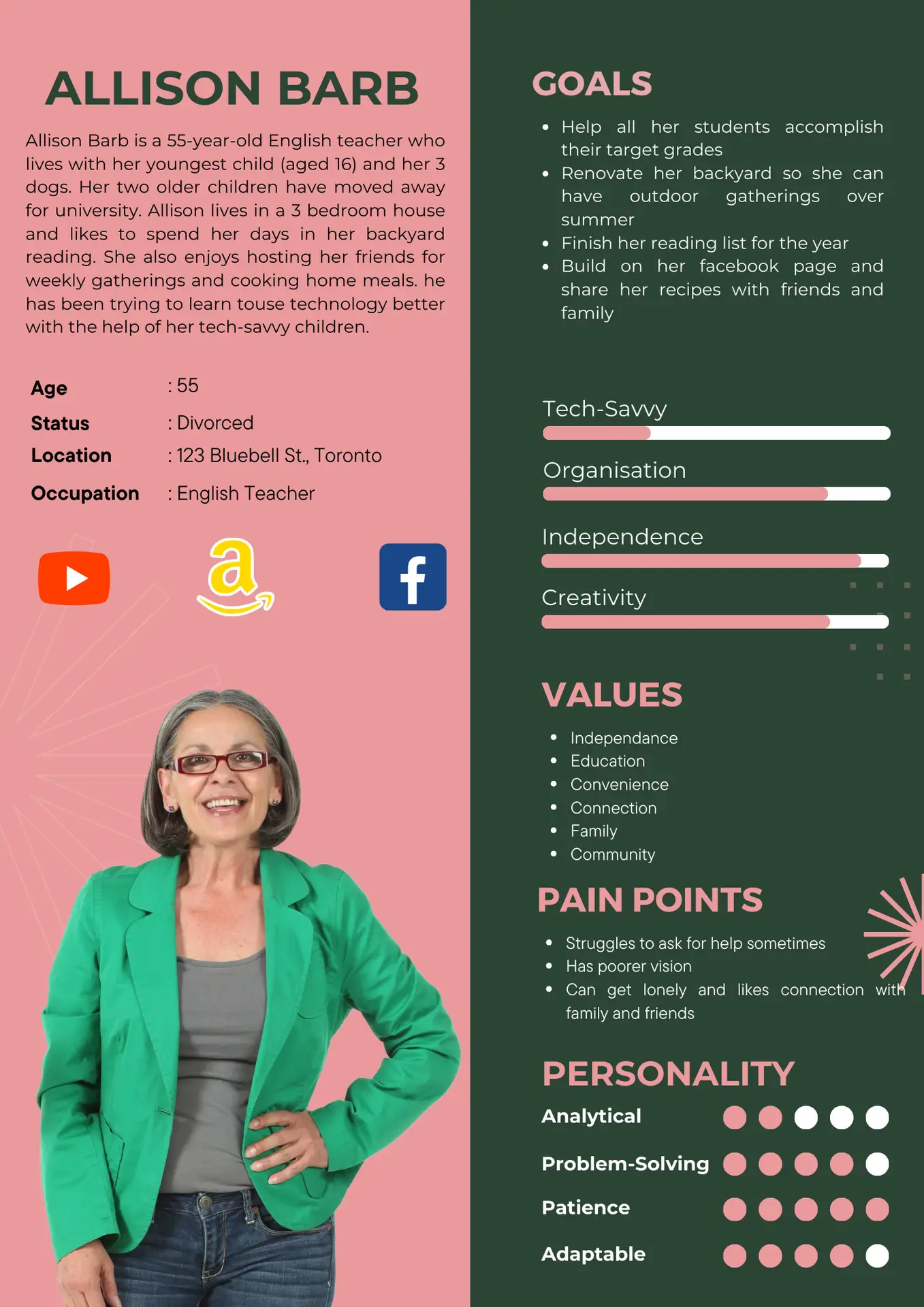
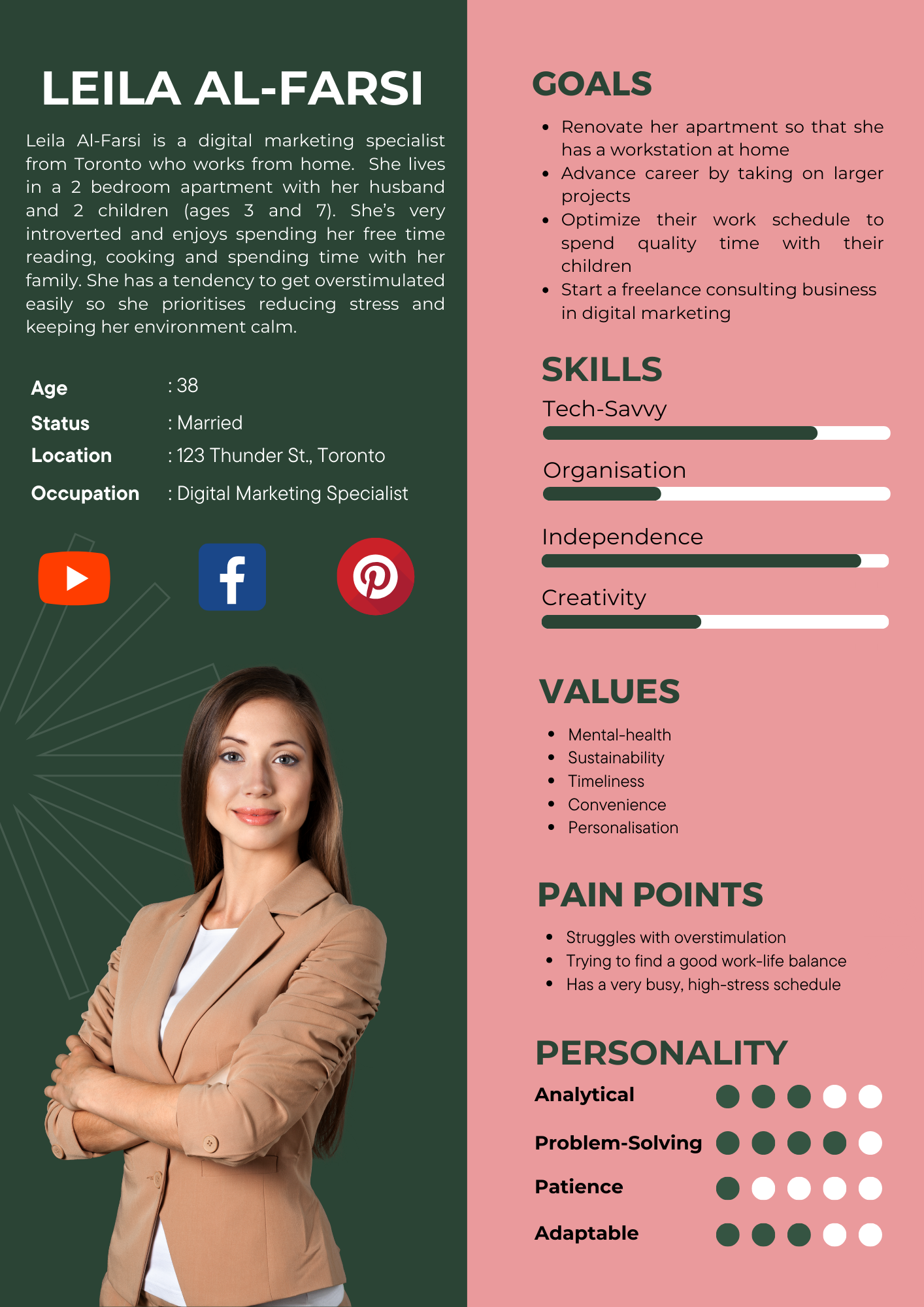
Then I created user personas to help me beter understand my users, particullary the buyers since that was a broader group in comparison to my sellers who were highly targeted.
Pt. 3: Style Tiles & Design Concept
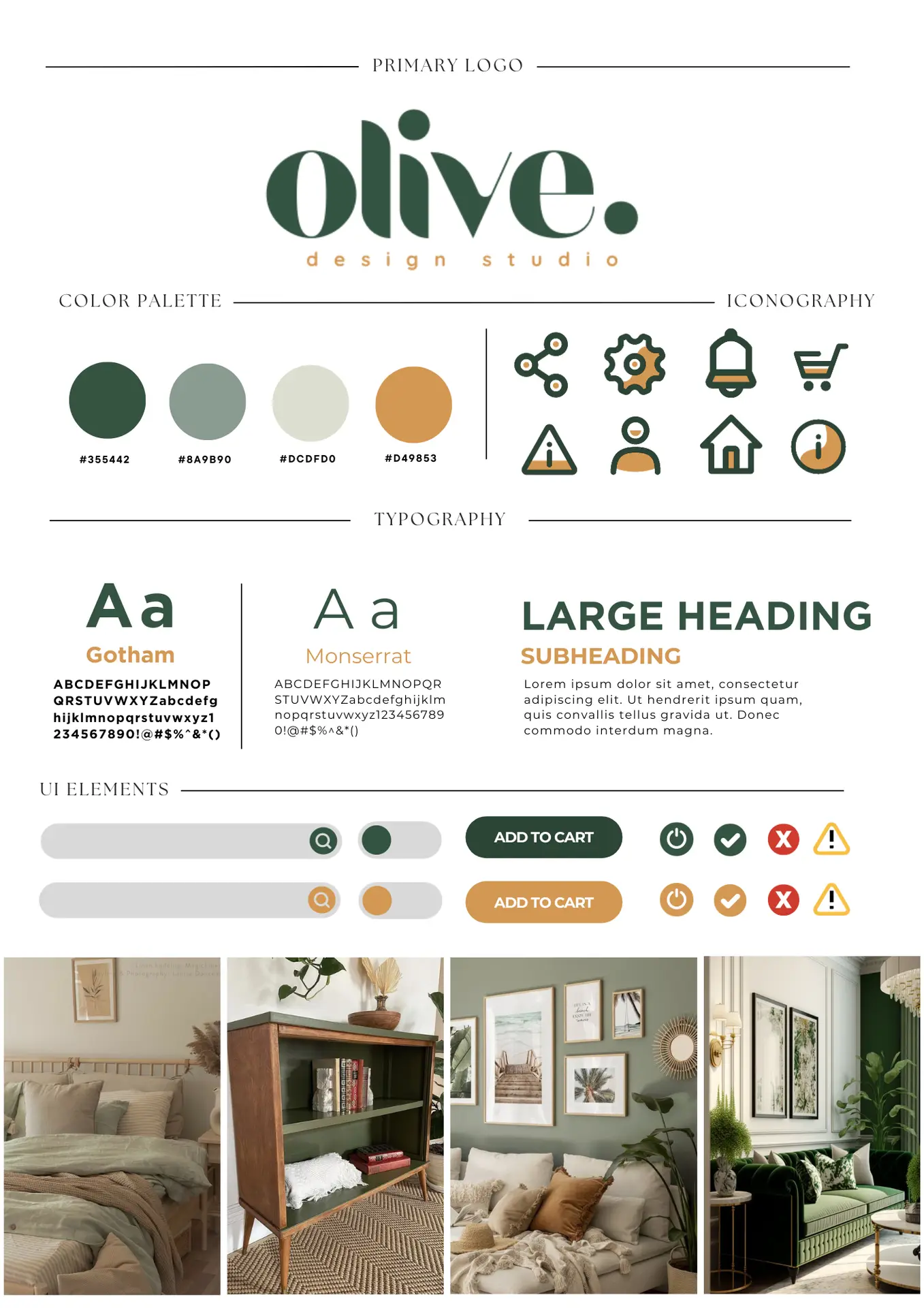
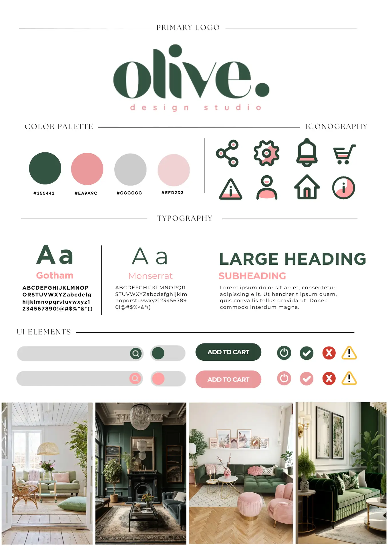
I wanted to give the app a clean, sophisticated look that complemented the innovative nature of the furniture designs, while still maintaining a user-friendly feel. The color palette was a mix of neutral tones with soft accent colors to evoke a sense of warmth and creativity. The typography was simple, modern, and highly readable across various device sizes.
Once I had a clear understanding of the user needs, I began to focus on the visual aspects of the app. To create a strong, consistent brand identity for Olive Furniture, I developed a set of style tiles. These included various color palettes, typography, and design elements that reflected the modern, minimalist style of the furniture while keeping it approachable for students and buyers alike.
I liked how the tan and pink colours complemented the main green colour. While the pink added a fun, youthful, and slightly quirky touch to the palette—which I personally found really unique and eye-catching—I had to take a step back and consider the broader context. My target buyer range was quite wide, spanning from 25 to 60 years old, and while younger users may have found the pink playful and engaging, it risked alienating the older demographic.
After testing the combinations and reflecting on the brand identity, I decided it would be more effective to go with the green and tan. This pairing felt more grounded, sophisticated, and versatile. The green gave the brand a fresh, earthy vibe that aligned with the organic and handmade nature of the furniture, while the tan added warmth and elegance without overpowering the core design. Together, they created a calm and mature aesthetic that could appeal across the full range of users, regardless of age, while still feeling distinct and intentional.
Pt. 4: Rough Sketches & Ideation
After finalizing the visual direction, I moved on to creating initial sketches to quickly explore different design layouts and interactions. These rough sketches allowed me to visualize how the content would flow from screen to screen and helped me identify any potential usability issues early on.
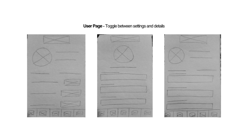
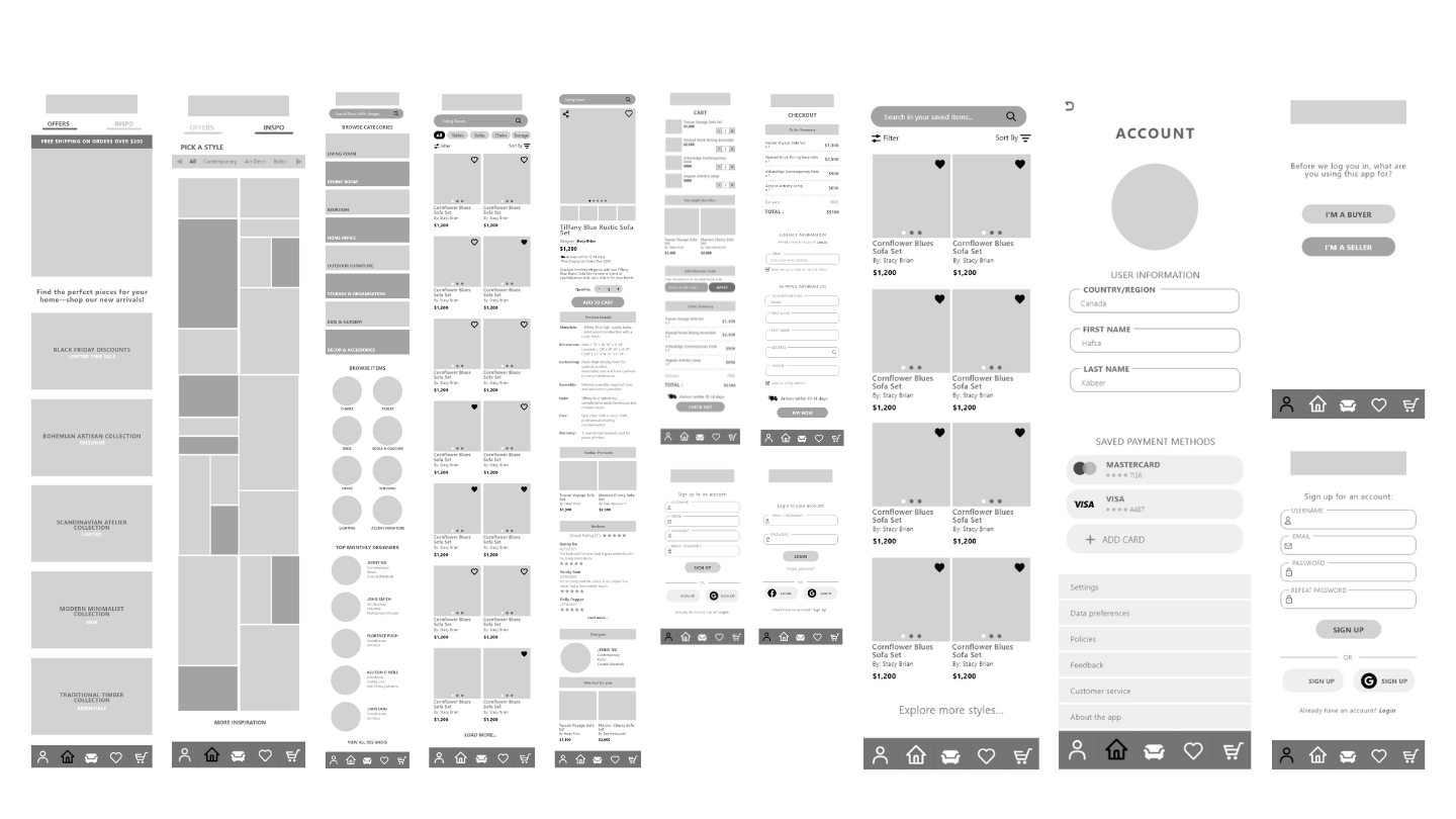
Pt. 5: Low-Fidelity & Medium-Fidelity Wireframes
Following the rough sketches, I proceeded with Low-Fidelity (LF) wireframes to establish the basic structure and layout of the app. The LF wireframes helped me focus purely on the functionality without getting distracted by design elements.
Once the LF wireframes were reviewed and iterated upon, I moved on to the Medium-Fidelity (MF) wireframes. These were more detailed, incorporating some of the actual design elements such as fonts and placeholders for images. I used these MF wireframes for the first round of design reviews with stakeholders and users, gathering feedback to refine the direction.
Pt. 6: Usability Testing & Design Reviews
With the interactive prototype in place, I conducted usability testing. I focused on gathering user feedback from both the sellers and buyers, testing the app’s navigation, the ease of uploading furniture designs, and the overall shopping experience. Throughout the design process, I held regular design reviews with the project stakeholders, including the client and the development team. These reviews were crucial in ensuring that the design aligned with the project’s goals and business needs. I made several iterations based on the feedback from these reviews.
Pt. 7: Reflection & Next Steps
This project was an exciting opportunity to fully explore both the functional and creative aspects of app design. Working independently, I was responsible for everything from initial research and user analysis to visual branding and feature ideation. It was especially rewarding to come up with features that balanced the needs of two very different user groups—buyers and student sellers—while working within realistic constraints that shaped the app’s direction in thoughtful ways.
One of the most enjoyable parts of the process was experimenting with colour palettes, designing the logo, and building a strong, cohesive brand identity. I wanted the app to feel approachable yet professional, and establishing that through colour and tone was a fun creative challenge.
The research process played a big role in shaping the final prototype. From identifying user needs to refining features based on usability testing and design reviews, each decision was backed by clear insights. I’m proud of the functional, user-focused platform I’ve created—one that not only looks good but truly serves its audience.