Pt. 1: Introduction
For this project, I worked with Enhance to Advance (ETA) Learning, a tutoring company that focuses on providing personalized, engaging learning experiences for children. The goal was to help them establish a strong brand identity, design essential company assets, and create a professional online presence.
The founder had a very clear vision for the brand and was incredibly detail-oriented and opinionated. It made this experience uniquely challenging because I had to learn to step back, set aside my own creative instincts at times, and focus entirely on executing her vision with precision.
Technology used:
- Figma — was used for all wireframing and prototyping
- Adobe Creative Suite & Canva — was used to create custom graphics and design branded assets
Pt. 2: Branding & Logo Creation
ETA’s founder came into the project with a rough concept for a logo already in mind. My role was to take that vision and bring it to life, refining it into a polished and professional final version. This was an exercise in restraint and attention to detail—rather than ideating from scratch, my job was to stay loyal to the client’s direction while making sure it still worked across different formats and applications.
I also offered ideas for colour palettes to help give the company’s branding a strong direction. At this point I was trying to offer design ideas to see what was working and what wasn’t, as well as trying to get a sense of my client’s preferences and goals.
Pt. 3: Visual Identity & Brand Collateral
Once the logo was finalized, I developed a cohesive colour palette and typography style that matched the brand’s values—warm, educational, and child-friendly, while still maintaining a polished, trustworthy appearance for parents.
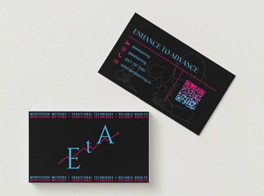
It took many iterations to get the logo exactly as the client wanted and needed some tweaking of the colours and spacing. But we finally managed to get it perfect and created the following logo:

Pt. 4: Company Assets
I then moved on to designing a variety of company assets, including:
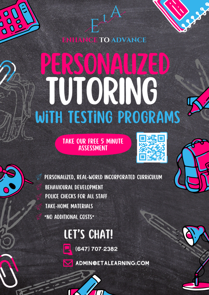
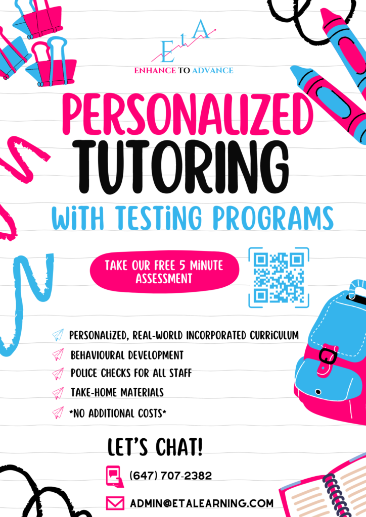
- Promotional flyers
- Informational brochures
- Custom-designed worksheets
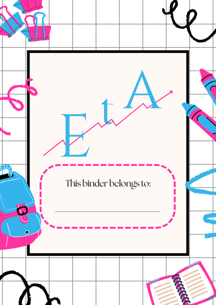
- Binder and folder covers
- Business cards
Each piece had to follow strict visual consistency and meet very specific layout and content guidelines, as per the founder’s direction.
Business Cards
Promotional Flyers
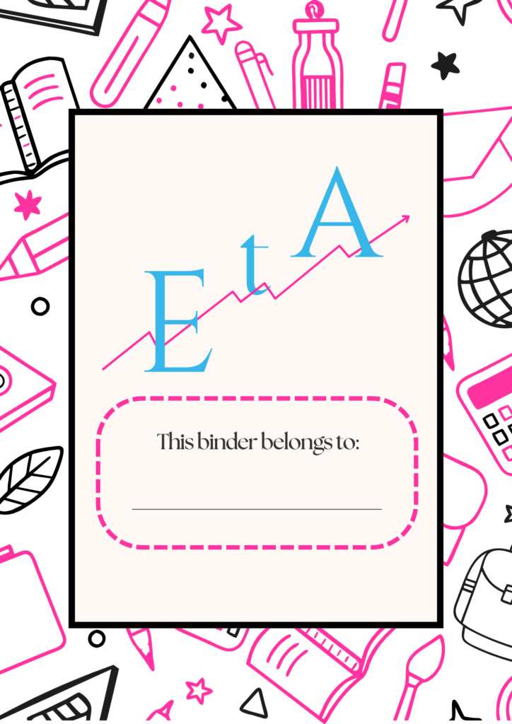
Binder Covers
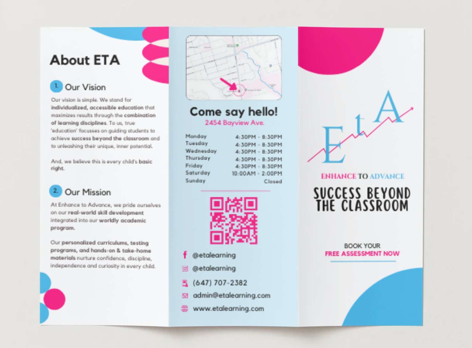
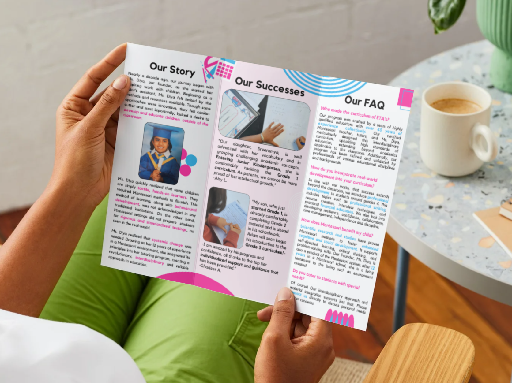
Brochure
Custom-Designed Worksheets
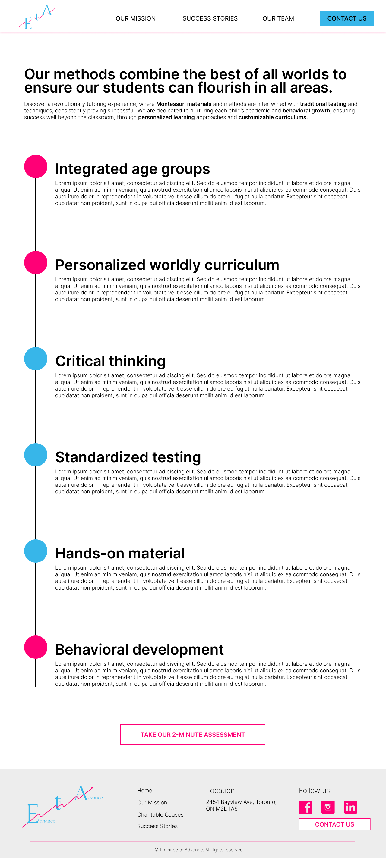
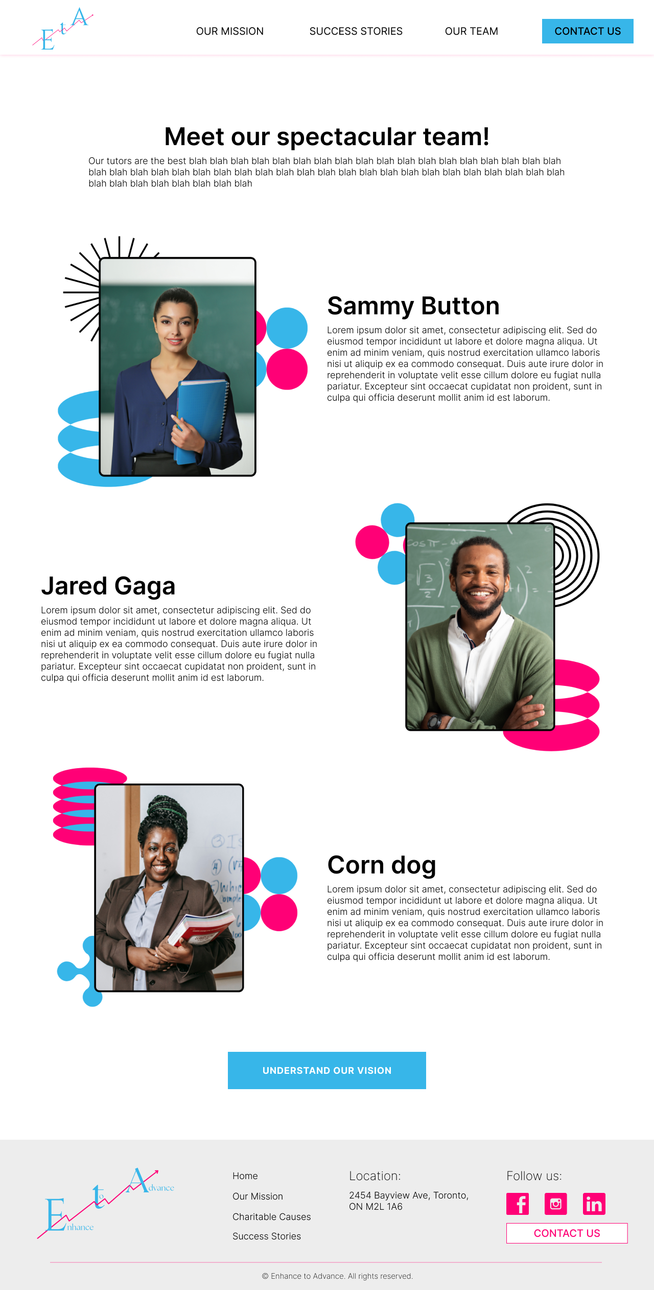
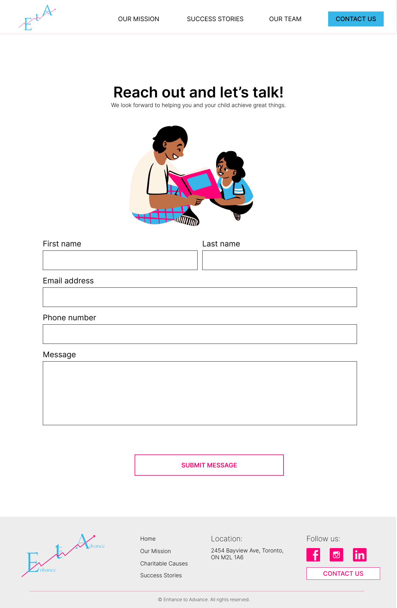
Pt. 4: Website Design
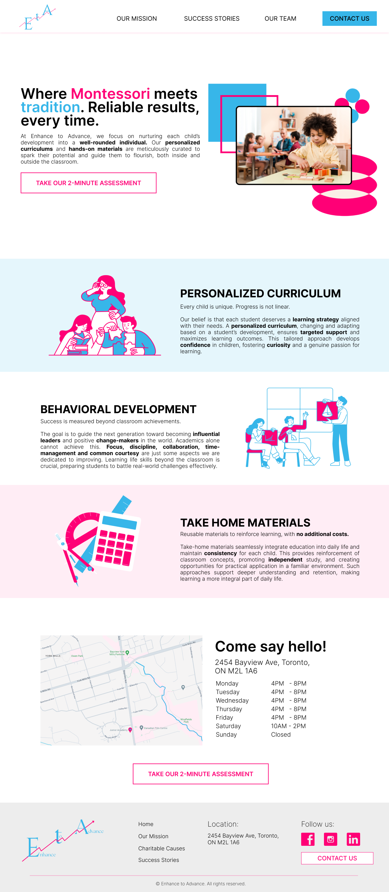
The next step was building the company’s website. While the final development was handed off to ETA’s software developer, I was responsible for designing the full site layout. This included wireframes, UI design, and desktop/mobile responsiveness. The website was designed to reflect the brand’s core values and act as a central hub for information, inquiries, and learning resources.
Working on this with a highly particular client really taught me how to communicate clearly, explain design decisions when needed, and most importantly—how to truly listen.
Pt. 5: Marketing Strategy
In addition to design work, I also developed a detailed marketing plan to help ETA improve its presence online and within the local community. This included:
Pt. 6: Reflection
This was one of the most unique client experiences I’ve had—not because of the scope of work, but because of how particular the client was. Unlike other clients who may lean on me for creative direction, this project required me to stay extremely aligned with someone else’s very specific vision.
It was a challenge to put aside my own design preferences, but I’m proud of the way I adapted and delivered work that met her high expectations. In the end, I was able to execute a full visual and digital identity that reflected the founder’s mission and values, and most importantly, made her happy.