Pt. 1: Introduction
For this project, I was working with a cosmetic and beauty company (specifically the education sector), Sakaaz Academy. The goal of the company was to have a complete rebrand, including a new logo, and to conduct thorough market and user research. The company was also planning to launch new products so there were 3 specific elements for me to focus on:
- Academy – the company has a beauty academy that offers classes on skin, hair and makeup at various different levels by technical beauty experts.
- Product – the company is planning to launch wax products in the future.
- Publishing – the company’s lead technician and founder is planning on publishing an educational book to sell in various markets.
Pt. 2: Target Users & Market Positioning
During this stage, I first identified the target users for the company, separating the task into the 3 different elements that were discussed in the introduction. Additionally I also conducted a market analysis and created user personas to aid with this initiative. Finally, I developed an initial mood board concept to help start the redesign initiatives.
The company colours were also changed from a bright pink to a light purple (reflected in the final colour palette). This was because the beauty industry is oversaturated with companies that have pink as the company colour so the purple helps Sakaaz stand apart. The particular palette that was chosen not only reflects that the company is in the beauty sector, but also adds an element of regality, femininity, power and uniqueness – all traits that effectively convey the brand.
Here is the research document that was shared with the client:
Pt. 3: Competitive Analysis & Feature Prioritisation
During this part of the research, I conducted thorough competitive analysis by performing pain point and opportunity analysis and SWOT analysis, for the academy and product. As per the request of my client, I focused on these 2 more heavily as they were the priority and since my client was still in the process of making decisions regarding the publishing location/language, it was set aside for the time being. I ended this section of the research by compiling a feature priortisation list that highlighted all the important elements needed for success.
Pt. 4: Research Analysis & Report
Finally, the research initiative for this stage came to an end with the final research analysis and report that compiled all the information from the previous stages as well as giving insights into future stategies.
Pt. 5: Logo Creation
Next, using all my research and the moodboard and colour palette shown previously (all approved by the client), I created various different logo samples that reflected Sakaaz as a brand. I offered variations of the logo in black/white mode to help the client make their decision more easily and offered a variety of different styles.
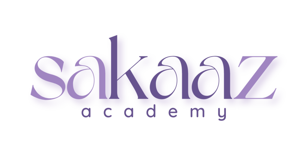
In the end my client was favouring this particular logo:

Pt. 10: Reflection & Next Steps
Currently this is still an ongoing project and my client plans to continue working with me to create a market stategy, design and develop a website, design the packaging for the wax products and help with the design of the publishing book.
This was an extremely rewarding project overall, and it was very interesting to do all the research. It was also very fun to get to do a complete rebrand and I enjoyed the creative freedom since my client was very flexible and open minded.


