Pt. 1: Introduction & Final
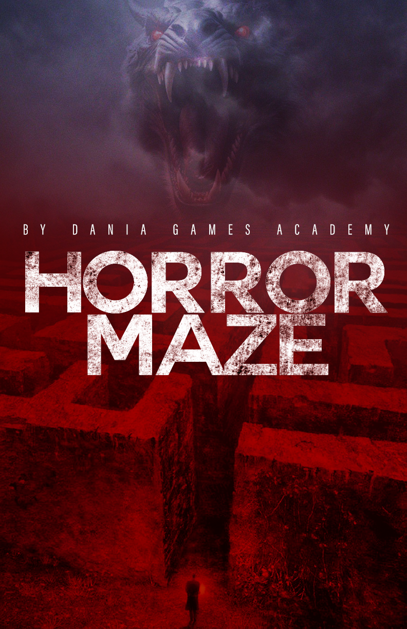
For this collaborative project, I was very fortunate to get the opportunity to work with the game developers for the game Horror Maze by Dania Games. After meeting with the game developers and discussing their vision for their game as well as my ideas, we decided to create promotional content for their game to help establish the game’s identity.
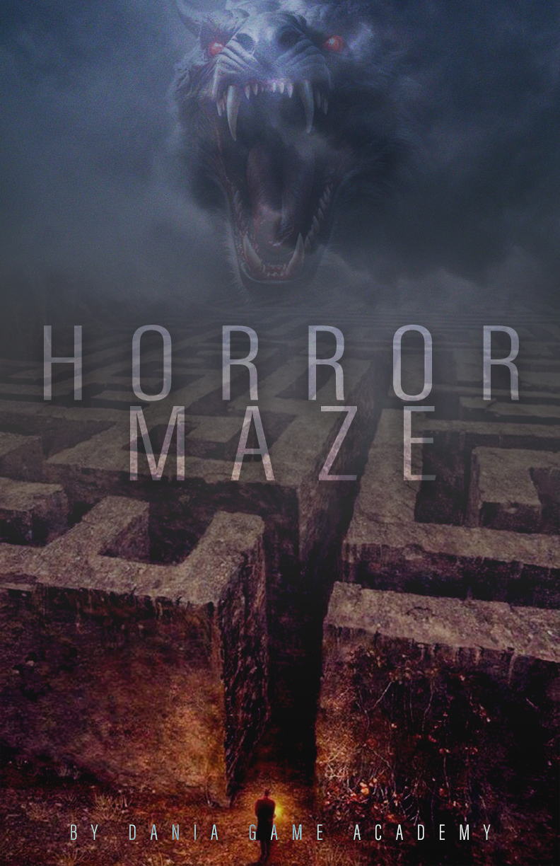
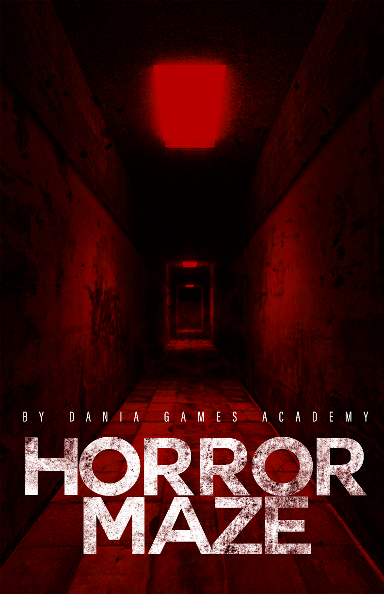
I ended up creating 3 graphic design posters (with variations) and a simple website to showcase the game.
Here are the final posters:
Here is a walkthrough of the final design of the website (made with HTML, CSS and Javascript):
Technology used:
- Photoshop — was used to create the graphic design posters.
- Visual Studio Code — was used to create the website (HTML, CSS & Javascript)
Now I’ll go over the process of how I got to my final products and walkthrough my creative process.
Pt. 2: Research
The first step was research. I started my research off by looking at other posters for horror games to draw inspiration and try and identify the main features that made each poster a good poster. The following images include the main posters that I inspected:
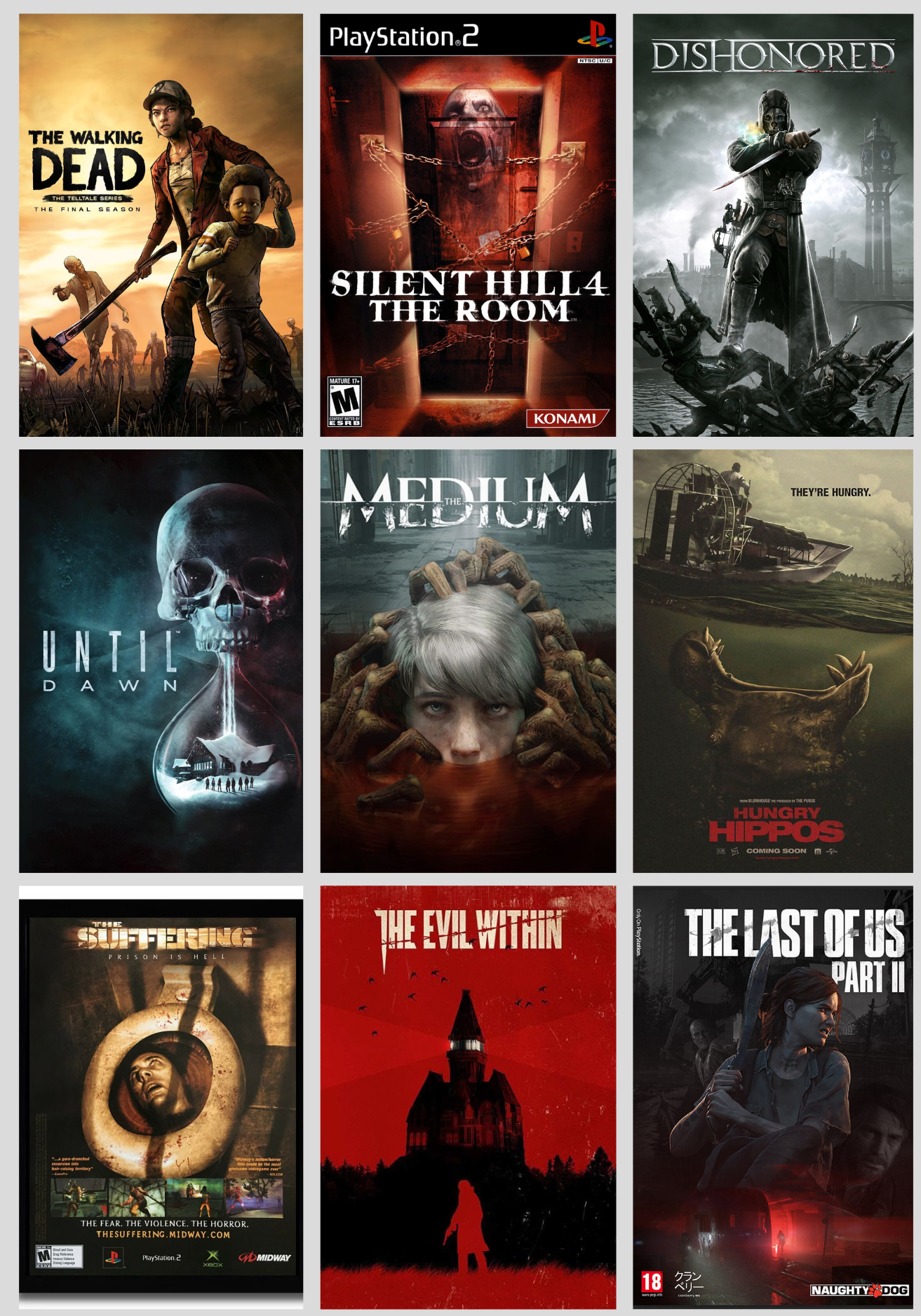
While each graphic style is in some way unique to its respective game, there are certain features that the majority of horror game posters implement:
- Bold capitalised fonts, popularly in shades of white or red
- Dark images/graphics
- Sharp contrasts
- Grainy taints and yellowish hues
- Violent undertones
- Dimmer lighting
- Uncertain/Ambiguous imagery to keep sense of mystery
Next, I wanted to research different elements that are implemented in horror games as well as horror game posters/graphics to see what themes I could extract for my own creations.
Interaction: A crucial aspect of horror games is the player’s interaction with the game world. The responsiveness of controls and character movement plays a vital role in maintaining immersion (Williams, 2022).
Immersion: Immersion is essential for creating a realistic and terrifying experience. The atmosphere, graphics, and narrative contribute to immersion. Atmospheric games that create a sense of the unknown and the eerie can elevate the horror experience. Realistic graphics also play a significant role in modern horror games (Williams, 2022).
Narrative: A compelling narrative is the final critical element in a horror video game. A well-crafted story is necessary to draw players in and evoke feelings of tension and fear. A poorly developed narrative can ruin the overall experience and hinder player immersion (Williams, 2022).
An Ordinary Protagonist: A relatable and vulnerable main character is crucial in a horror game to maintain suspense and realism. Players can better identify with characters who lack combat experience and understanding of the situation (Mukharjee, 2022).
Unpredictable Threats: Unpredictability in the form of traps, enemy encounters, and dangerous creatures keeps players engaged and anxious. The element of surprise is a cornerstone of horror games and can take various forms (Mukharjee, 2022).
Surviving Elements: Players in horror games must use all available means of survival, including weapons, tools, and resources. This adds to the challenge and urgency, creating moments of anxiety and adrenaline (Mukharjee, 2022).
According to (Anthony Scott Waters, 2015), here are some things to consider when creating horror-themed art, focusing on the psychological aspects of fear and the techniques artists can employ to evoke horror:
Audience Consideration: Tailor your artwork to your intended audience’s age and thresholds, adjusting the level of horror accordingly.
Vulnerability: Recognize who in your artwork is vulnerable, as this helps set up the suspense that leads to fear.
The Scare: Create a baseline for fear by highlighting elements in your artwork that stand out as different and potentially menacing.
Clarify the Threat: Build suspense by revealing the true nature of the threat in your artwork, helping to set expectations for the audience.
The Gross-Out: Handle the graphic and unsettling aspects of horror art carefully, considering the context and the danger of desensitization.
The Core Concept: Determine which aspect of fear you want to emphasize in your artwork, be it the scare, the gross-out, or something else.
Distortion of Form: Alter the human form in your artwork to generate unease and discomfort, emphasizing differences from the norm.
Mixing and Matching: Blend unexpected elements together in your artwork to create unsettling combinations, introducing new forms of horror.
Think Outside the Box: Explore the potential for everyday objects, machines, or buildings to be depicted as horrifying in your artwork.
Deciding on a Theme: Select a theme for your artwork that matches the desired level of horror, considering the atmosphere and client’s preferences.
Expand Your Horizons: Seek inspiration from films, authors, and artists known for their imaginative and horrifying works to enhance your creativity and ideas.
Pt. 3: Insights
Through the research, I gained many insights into elements I could incorporate into my own design. The following are the main ones that I will be focusing on:
- Include a main character for the audience to relate to (main character of the game)
- Create suspense with different elements
- Showcase different tools available in-game to create a sense of survival
- Tell a story through the visuals
- Implementation of darker colours and dimmer lighting
- Showcase the main threat of the game to amplify the fear factor
- Bold text that is capitalised
- Primary colours are favoured (in darker shades) with black and white
Pt. 4: Ideation
For the next step, I decided to create some sketches with some rough ideas of what I could do for my graphic design game posters. These would act as a general guideline for placements, layout and main elements that I could play with in the final designs. Due to my experimental design style, I often play around with different things when creating the final piece as I think it is a great way to learn new things and apply them too. However, the ideation with the sketches provides a great place to start.
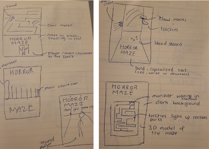
I personally really like the first, second and 4th sketch ideas. I think the first 2 would be extremely creative and implement lots of the elements that were deemed important for the horror genre. I also really like the 4th sketch because it is a lot more simple. It doesn’t include the graphics of the monster in the game but it still creates suspense and mystery with the other graphics.
Pt. 5: Production — Poster
The next stage was the production stage where I finally got to put my ideas into action.
I started off with a stock image of a maze and applied various masks, gradients and colour correction tools to blur the background and create an ominious and foggy look. I also added more red tones to the image to create a more horror-feel. I wanted the maze to look ancient and unpredictable.
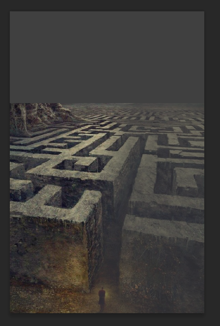
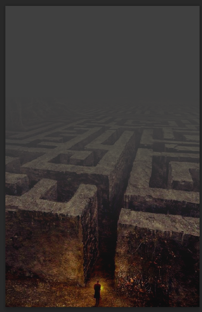
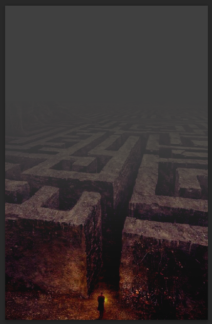
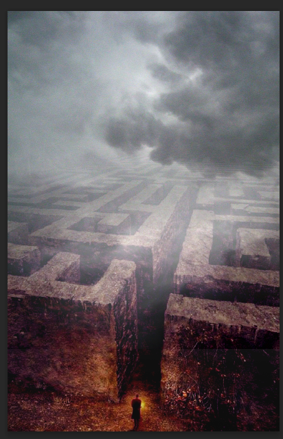
Next, I added a layer of clouds and blended them with the maze to further the feel of suspense and something sinister hiding in the maze. I decided to add bluish tones to the clouds to create a contrast with the reddish tones of the maze. I personally found that the colours really helped bring each other out and created an overall more mystical look.
This is important for my goal (promoting the game) as it is supposed to look scary for the players yet inviting at the same time — they need to feel tempted to play. And this particular colour combination and contrast of reds and blues is inviting in an esoteric way.
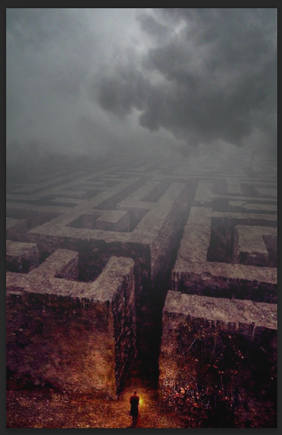
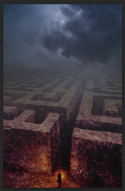
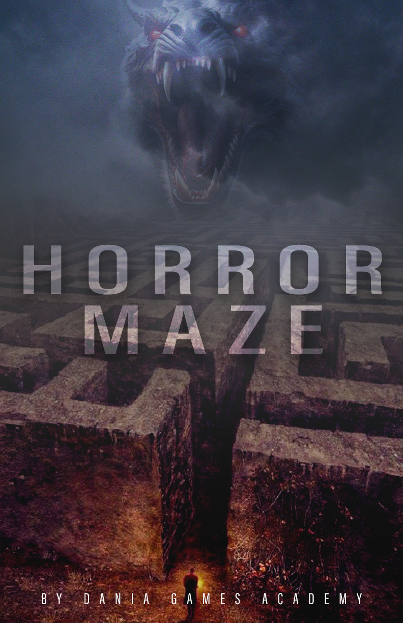
Next, I used the help of AI image generation and generated some images of monsters. After a few attempts at different prompts, I got the monster I was looking for. I removed the background and the body of the monster as I wanted the focus to be on the head. Initially, the head of the monster was too prominent and looked strange and out of place, so I decided to scale the head down and blend it in with the clouds to create a ghostly and terrifying illusion.
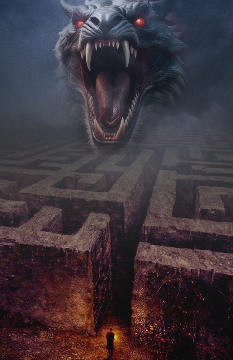
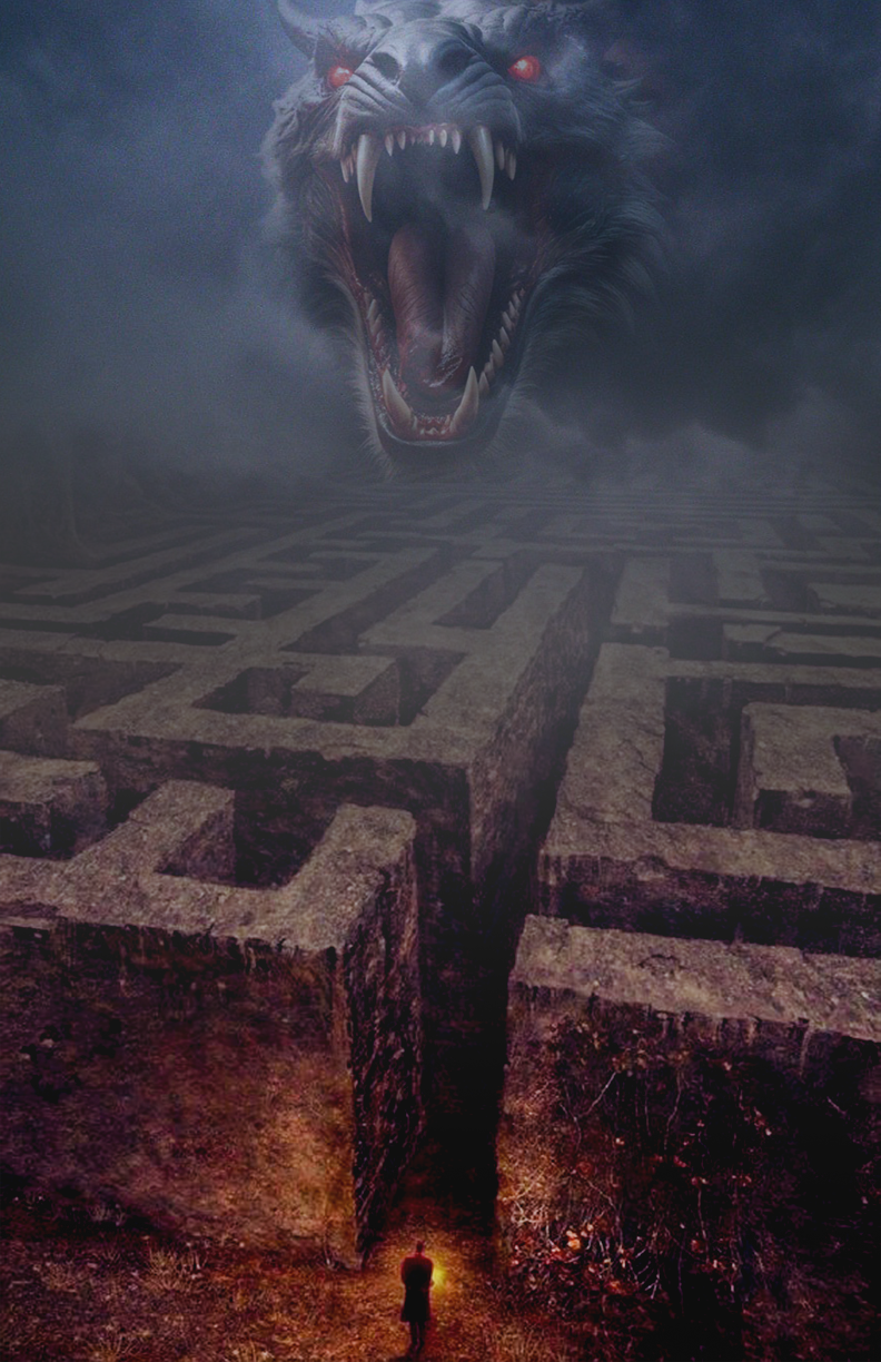
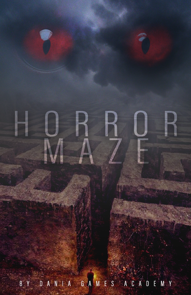
Next came the experimental phase. I played around with some different fonts, alternating between a lighter but more fantasy-themed font and a thicker, heavier more “horror-themed” font. I also tried a variation with a pair of red eyes (AI-generated) in the clouds (with the same techniques used for the monster).
I did like that version too, it creates a very unsettling feeling and the red/blue contrasts are more consistent.

I also experimented with the red and white contrast as well as the grunge-themed font. I used a stock image of blood splatters to fill the font to accentuate the “horror” feel. This was my favourite font and I think it worked best for the purpose of these posters — to invoke horror.
I also liked the idea of having the maze be red while still maintaining the blue/red contrast with the blue tones for the monster in the clouds.
This particular layout is also very effective and follows in suit with the research I had conducted.
Viewers are able to see the vast size of the monster and the maze while also being able to see the person standing in front of the maze with a lantern. The size difference put into perspective creates an unsettling feeling and the monster being in the sky in the back away from the eyeshot of the person (player POV) alludes to the horrors that await the player in the maze which they couldn’t see coming.


I also looked at the idea of the monster not being present in the final image and to make up for the space above the maze, I moved the font upwards. I think this did work because it allows the viewers to see more of the maze but because it is so foggy and the maze is blurred in with the back, it creates more mystery and suspense — there is horror in the unknown.
The second variation was created with a stock image of an empty hallway. I applied various different colour edits to get the perfect blend of black and red. This uses a different perspective (first person) and doesn’t include any threats that are visible right away, but similar to the last variation, it is horror that relies on the suspense and the unknown.
Even though the viewers can’t see the monster (or any other immediate threat), with the use of the black and red and the unknown at the end of the hallway, it achieves the same result in a much simpler way.
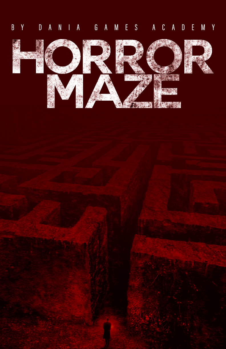

The final poster I selected was:

Pt. 5: Production — Website
I also worked on creating a simple website to showcase the game and the posters. This webite is a general framework and made with the intention of future customisations according to the preference of the game developers and Dania Games Academy.
The main colours I used were a dark grey, red and white — consistent with my poster colours too.
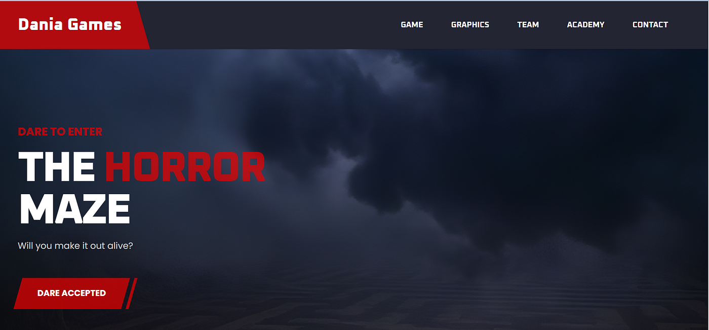
For the front page, I decided to stick to the suspense route of the horror and use an image of the maze being overshadowed by the dark clouds. I used provoking and inciting phrases like “Dare to enter” and “Will you make it out alive” to challenge the players.
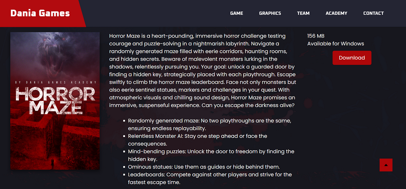
The next part of the site includes the main information about the game. I decided to include a full description of the game (paragraph) as well as as bullet points to highlight the main features.
The far right also includes game specifications and the option to download the game. Under this section I had a special “Graphics” section that just displayed some more of the poster designs.
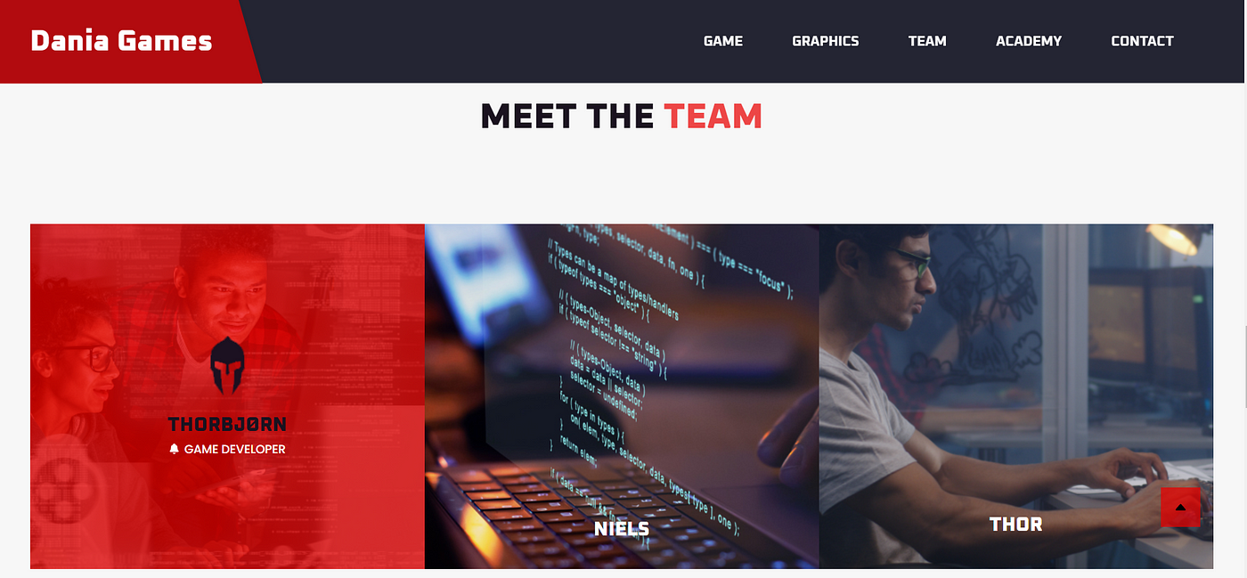
The next part is very important to the promotional aspect, not just promoting the game but also promoting the developers. This area allows the developers to gain exposure and put their names out there. It allows them to introduce themselves to their players as well.

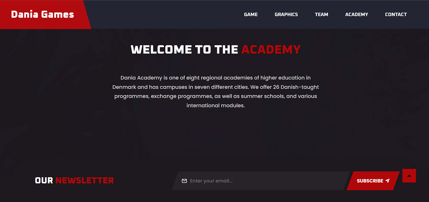
I also included a section for the academy, including main information (sourced from https://eadania.com/). However, I didn’t want to go into too much detail as this is intended to put the focus on the game developers and their game primarily.
I also included a section for a newsletter at the bottom so that the game developers could have an opportunity to reach out to their player if they have new games/features being launched.
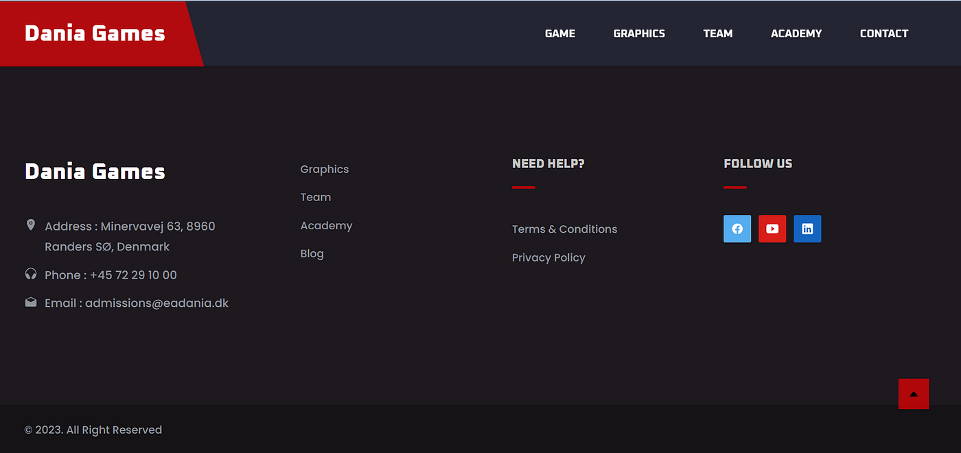
Finally, the footer is pretty simple with the main contact information, the navigation options, terms and conditions and the socials. It is intended to be customisable as the game developers for Horror Maze haven’t invested much time into their image and promotion, I still wanted to leave them some autonomy to make choices about how they want to present not just themselves but also their wonderful work.
Pt. 6: Reflection
Working with Dania Games was a really fun and creatively energizing experience. Since it was a collaboration with a game design school, there was a lot of room to experiment visually and really lean into the world of the game. I loved being able to support their team by creating promotional posters and a simple but effective website to showcase their game.
This project reminded me of how design and storytelling work hand in hand—especially in the world of games. Every poster, layout choice, and color decision had to align with the game’s tone, narrative, and audience. I got to step into their world for a little while and help bring it to life visually.
It was also a great opportunity to collaborate across cultures and time zones, which came with its own set of communication challenges but also a lot of learning. Overall, it was a short but very fulfilling project that allowed me to contribute meaningfully to something really imaginative and fun.
References:
Anthony Scott Waters. (2015, August 4). 12 tips for creating truly terrifying art. Creative Bloq; Creative Bloq. https://www.creativebloq.com/fantasy/terrifying-art-tips-71515949
Mukharjee, S. (2022, August 6). 5 things that make a good horror game great. Www.sportskeeda.com. https://www.sportskeeda.com/esports/5-things-make-good- horror-game-great
Williams, K. (2022, November 12). What Makes A Good Horror Video Game? ScreenRant. https://screenrant.com/what-makes-good-horror-video-game/
